Entanglements with Data from the domestic Internet of things
How do we interact with data in the home?
Design Research Group Study led by Assistant Professor Audrey Desjardins (UW); 2018-2019

Examples of domestic IoT: wyze cam, google home, and nest thermostat.
Publications:
IoT Data in the Home: Observing Entanglements and Drawing New Encounters. ACM CHI Conference on Human Factors in Computing System 2020
Project Description:
This year-long ethnography-inspired study sought to understand the ways people live with and access the data which is constantly collected by ‘smart’ or connected devices in the home. This research seeks to understand how people live with data from their domestic IoT devices—how they engage with and understand it, and how it shapes day-to-day live in subtle and unexpected ways. It also seeks to examine access, opacity, privacy and emergent ethical concerns around data.
Research Questions
How do people understand data from their internet of things devices in their home?
How do they interact with and experience data in their day-to-day lives.
How might this knowledge reframe what roles data can play as we design domestic technologies?
Ideological Framing
Although contemporary philosophers like Byung-Chul Han claim data is ‘smooth’ and transparent aesthetically, other theorists such as Ellen Lupton, Yanni Alexander Loukissas, and Paul Dourish argue that data is rhetorical, situated, local, messy and lively. We sought to see data as a phenomenon that is non-universal or objective and smooth, but messy, glitchy, local and situated.
Research Methods
Home tours
Seeing how people interact with and conceptualize home data
Sketching reflective postcards
Synthesizing/refracting themes, soliciting participant feedback
Reflective thematic Analysis
Reflecting on the project and generating new ways to design with data.
Recruitment
When recruiting, we prioritized participants with different living situations as well as different amounts and types of IoT devices in their homes (between 1 and 60 items such as smart light bulbs, smart thermostats, connected security systems including motion detectors and cameras, voice assistants, home hubs, smart plugs, etc.).
Home Tours
After screening participants, two researchers visited their homes for 60 to 90 minutes. Together, we walked through the home and asked participants to show use each IoT device in their home. For each, we asked how and why they got it, and how they currently use it. We asked what data were associated with it, what those data look like, and how/if they engaged with those data. We also asked participants to show us which data they knew how to access. If they didn’t know how to access them, we offered to investigate with them during the home visit. Participants took screenshots of these data interfaces to share with us.


Thematic Analysis and Sketching Speculative Postcards
We then used thematic and axial coding to organize our findings into themes. Our group worked together to sketch an IoT concept that would reflect a theme we found in relation to home IoT data. We shared and critiqued ideas as a group and pinned them to a wall to keep them visible to reference in future iterations.

Wall of imaginary IoT sketches addressing different data themes
We used these sketches to refine our themes and narrow to five central themes which we refined and turned into postcards. These postcards had a sketch on one side and a space for participant responses on the back. We only got postcards back from a handful of participants, but their responses were quite valuable.


Final Postcards and Themes
Below are explanations of the five themes which describe how we saw our participants engage with IoT data in their home and corresponding response via speculative postcard which pushes these themes into playful, generative design spaces. These themes describe usage of data, but also how data is conceptualized, and how it becomes part of living with connected devices at home.
Manifesting: Data’s many forms
We saw data manifest in apps as a smooth and objective thing — via graphs and charts with rounded corners and calming colors. However in people’s homes we saw interesting manifestations — for example: when one participant came home from vacation they noticed their cats would run back and forth from the heaters (which they had turned on via a Nest App) trying to balance time between greeting the owners and being warm again after heaters had been off for a while.
To reflect on this, we sketched the Data Reality glasses where you can see data accumulating around the objects in your home. Some participants reported this made data feel like a mess or a chore. We wondered if the ‘invisibility’ of data is an easy way to forget about its actuality.

Data as Bread Crumbs
Data as breadcrumbs is a way that people use the logs of data to look back at happenings or histories. We saw someone use their Alexa voice history to look back at favorite recipes. However, in another case, we saw surveillance glitch capture a ghostly home break in. While homeowners were away on vacation, their motion camera took a picture of nothing which had them pouring over data logs to try to deduce if anything had actually happened.
To reflect on data as bread crumbs, we sketched the data dunes. Data dunes are a physical representation of the history of your data which you can manipulate by removing or adding data. This made participants wonder about the possibility of not only viewing, but also manipulating their data histories.

Repositioning: Data through personal frames
We also saw that data was interpreted differently by different homeowners. Ones with history as air pollution scientists were able to critique the home air quality monitor and people with a history of domestic violence took their privacy more seriously than some other participants.
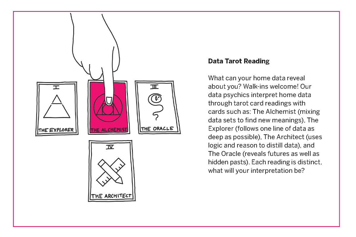
In response we sketched the Data Tarot Reading to emphasize how data are interpreted from the perspective of a different positions which could even be in contrast or divergent. Participants expressed interest, wondering if other people might find more value in their data than they could themselves, or speaking of it as a way to discover different ways to ‘mine’ data in their home.

Exposing: Data as evidence?
We observed that data collected in the home is often used as a way of potentially proving something happened which offers peace of mind, such surveillance video archives offered by home security systems. We also observed another facet of this ‘evidentiary’ reading of data, which is that people perceived data as objective and human perception is subjective. In one example, a participant told us an anecdote about how she perceived her elevator as exceptionally slow, but after collecting data on time spent in the elevator for one week, she discovered the elevator actually only takes about 15 seconds to go from the ground floor to her apartment’s floor. She shifted her perception using data she collected herself.
To respond to these findings, we drew the honest time blocks. These time blocks show videos of activities that all take about the same time, captured within someone’s home, showing evidence of the amount of time it takes them do do tasks within their home. Some participants responded this might prove that they are less efficient than they think they are, or should be more productive.

Broadening: Data for others, data as others
This theme reflects participant’s awareness that data is not being used purely for them, nor does it stay within their homes. One participant explained how corporations like Google are using their data and resurfacing it as services, but they feel relatively comfortable with the arrangement.
To reflect on this, we created the concept of data epics, a service where your data is interpreted by a fiction author and given back to the participant as a short story or novella. Participants loved this idea and imagined trying to bend the storyline by changing the way data would behave in the home.

Discussion
We conclude our research for three possible new ways to consider data in design moving forward:
Data as Primary Focus
We observed that data is often a by-product of designing IoT devices in the home — having subtle impacts on those people using IoT devices. However, we wonder how data could be more primary in connected devices—we opened doors to this by designing concepts which make data tangible, malleable, and readable to name a few primary expressions.Beyond self tracking and self improvement
We observe several ways that data could be used beyond current popular approaches which track behaviors for self improvement and reflection. We claim data can offer more diffuse and ambient ways of noticing, data could also be mostly silent until needed (for proof or recollection) and that data could be more imaginative and playful, opening avenues for personal engagement and interaction beyond improvement (like data epics seems to inspire).